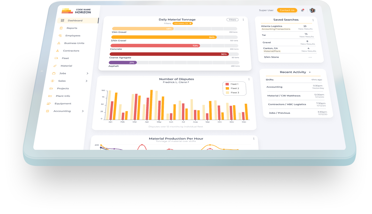
Horizon
data platform for resourcing and estimation in heavy construction
Role
Senior UI/UX Designer
Client
HaulHub Technologies
Medium
SaaS web app
(Figma)
Duration
Nov 2020
Nov 2021
Overview
Horizon was born based on the requirements of current clients and a largely archaic way to interact with data in the current industry. We took Horizon from an email exchange concept between stakeholders to a live product rolling out to users in less than a year.
Horizon is a data platform for resourcing and estimation in heavy construction. We brought together project, materials and contractor information from disparate systems to create an overview of the complete ecosystem for federally and state funded DOT projects.
Challenges
1. Data heavy product with very few images
2. Designing for users with limited technological knowledge
3. Conducting testing and interviews while maintaining product confidentiality
4. Advocating for design to stakeholders
Job Overview
My Role @ HaulHub
+ Execute projects from initial concept to post-MVP (Minimum Viable Product) phase, integrating stakeholder specifications with real-world demands to ensure a seamless user experience
+ Collaborate with global developer teams to ensure fidelity of mobile-first designs and desktop SaaS apps, utilizing clear communication and flexible methodology
+ Assumed responsibility for additional, partially completed projects as primary designer, effectively managing the timelines and requirements of multiple project managers at once
Research
Affinity Diagrams - Competitive Analysis - Interviews
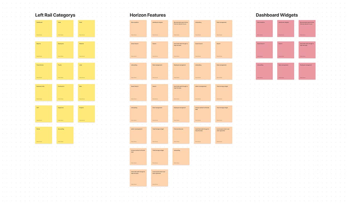
Affinity Diagramming
We brought in stakeholders and subject matter experts (SME) to sessions where we discussed features and ideas for Horizon. the goal was to think outside the box to create the perfect product for the market.
We took that data and organized it into categories and themes which helped us create the initial stories for the project.
Competitive Analysis Results
Most of the current solutions & methods to retrieve the data required information requests to counties and local municipalities. When the data was available, it was often in raw XML format and hard for humans to interpret.
Often, we found that no sites existed for the unique data HaulHub had compiled; this helped us focus on specific features to implement for the MVP.
Interviews
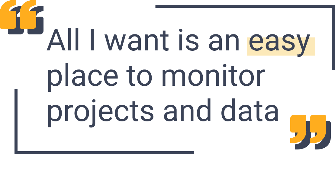
User interviews were extremely important in the design of Horizon. Interviews consisted of on-site shadowing and zoom meetings with industry professionals to get an idea of how they interacted with the data for their job.
After the intial designs and development, interviews were conducted again with the same users to gain new perspective on how Horizon could improve thier jobs.
Synthesis
Personas - Data Analysis - Concepts
Personas (Users)
Working with the feedback of stakeholders and the data we gathered from research sessions, we created personas to best represent Horizon’s core users.

James Steven
Age: 47
Location: Boston, MA
Role: Contractor“My project bids and monitoring jobs in my area is my #1 Priority!"
Goals:
1. Monitor project bids
2. See new jobs in the area
3. Contact sub contractors and drivers

Ed Dixie
Age: 62
Location: Austin, TX
Role: Plant Admin“I need to manage my crew and keep an eye on what is going on as easy as possible"
Goals:
1. View plant analytics on dashboard
2. Add/Remove users
3. Quickly see data reports for various plant functions
Analyzing the data
Using the research we conducted, we began to plan for the extensive role system Horizon would use. We designed a complex wireframe allowing us to plan out each permission as well as the initial page navigation.

Design Planning
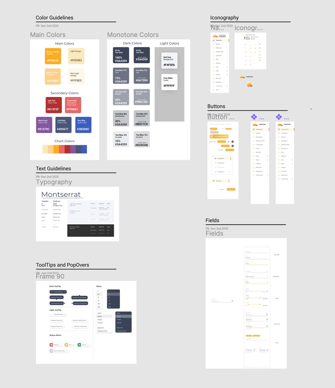
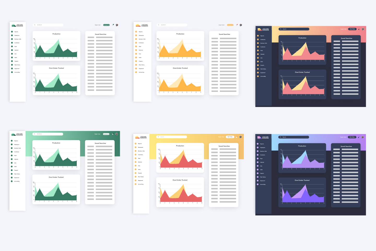
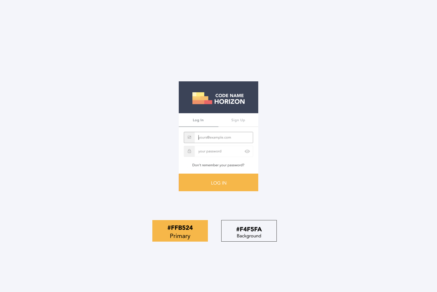
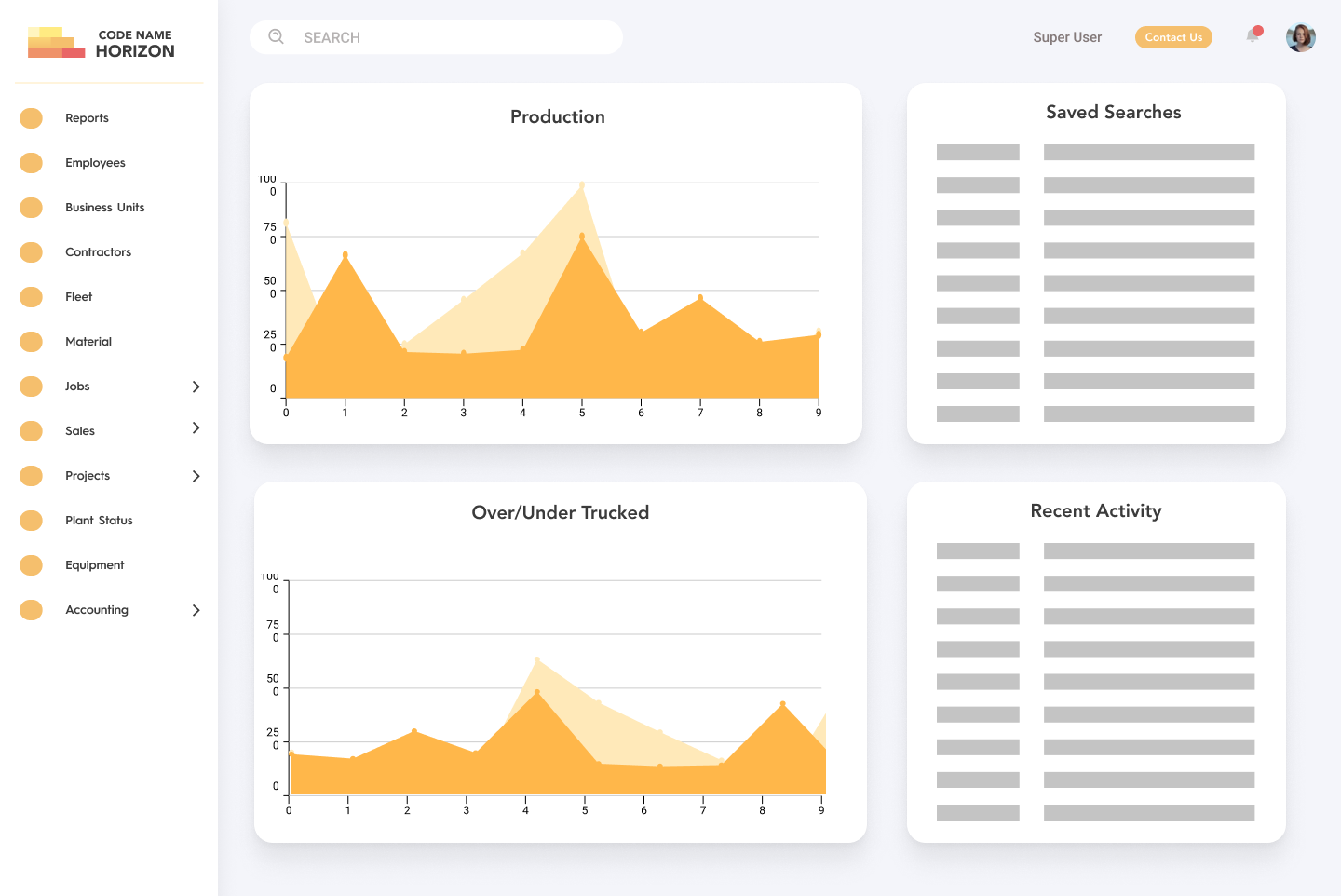
Initial planning and colors were done with open communication from stakeholders. Simple wireframes helped narrow down direction.
Design
User Testing - Designs
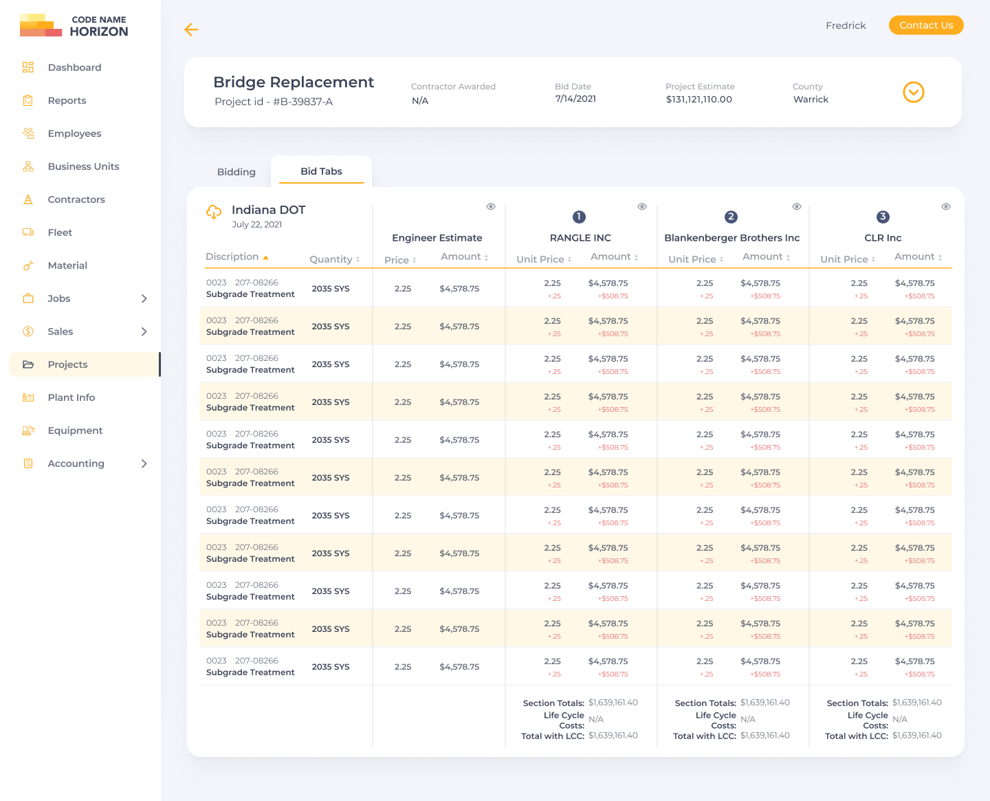
User Testing
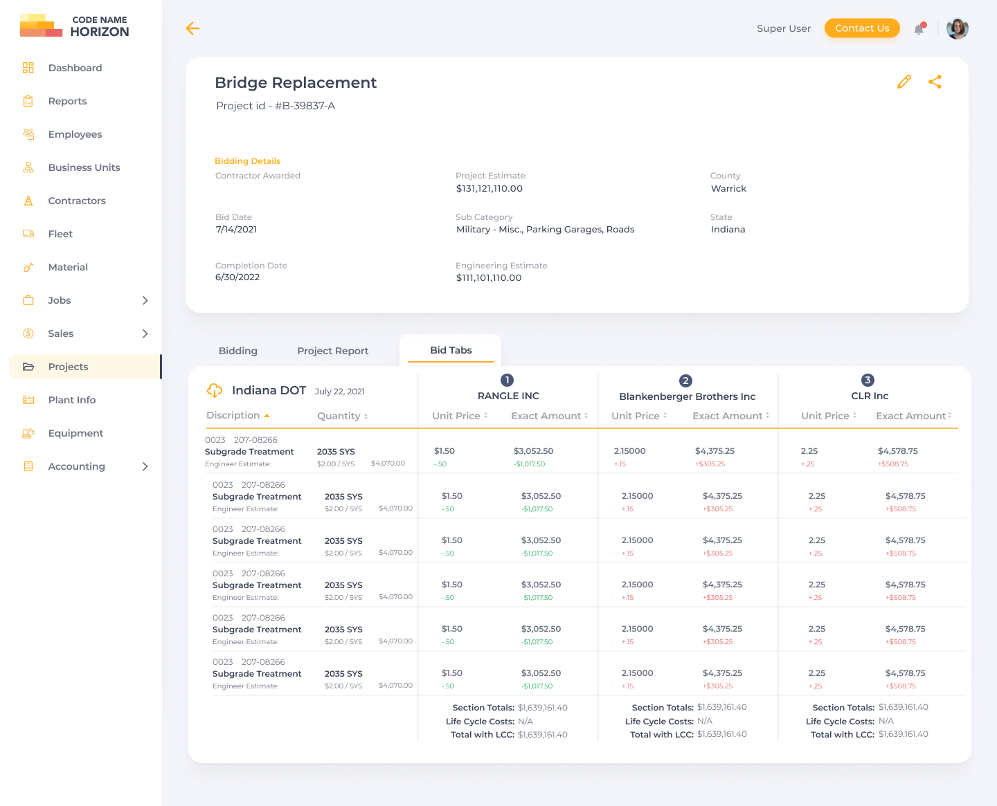
Test was conducted on the intial designs to gain feedback and iterate on the MVP. Those sessions helped dictate the current design of Horizon.
Here you can see the feedback led us to add various features for improved user experience, such as the ability to hide columns and collapse the project information.
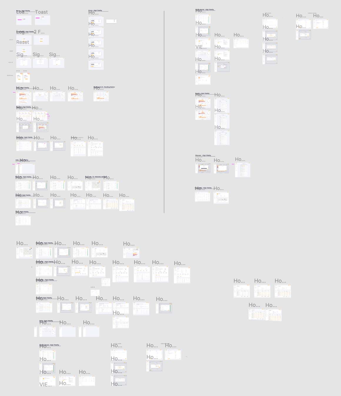
Figma Design Board
Design Style Guide
